Ever notice how a bold red mug grabs your attention, or how a calming blue notebook instantly feels trustworthy? That’s not a coincidence — it’s color psychology in action. The colors on your promotional products can spark excitement, inspire confidence, or convey sophistication long before someone even sees your logo.
In marketing, color isn’t just decoration; it’s communication. Through color psychology, brands use strategic hues to shape how people feel and what they remember. When your colors align with your brand’s personality and purpose, they do more than make products look great. They make them work harder for you.
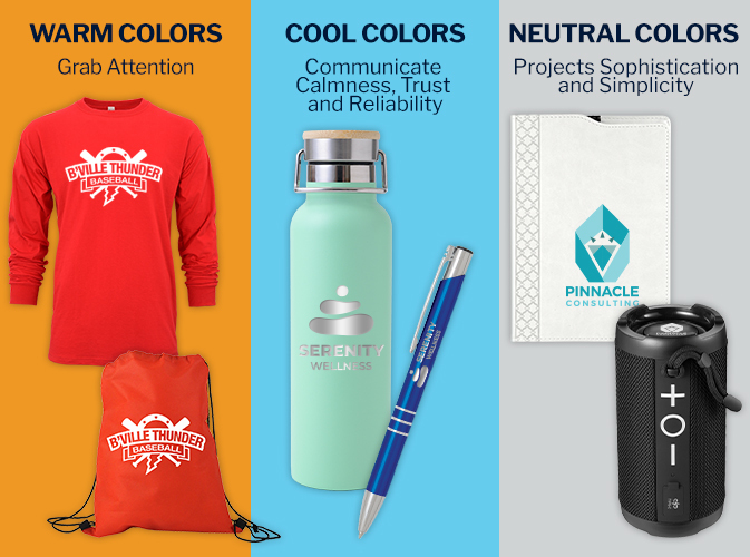
Understanding Color Psychology
Each color carries its own associations and can reinforce your message without a single word. For example:
- Warm colors like red, orange, and yellow grab attention. They create energy, urgency, and excitement — perfect for promotions, sales, and brands with bold, active personalities.
- Cool colors like blue, green, and purple communicate calmness, trust, and reliability. Blue inspires confidence, green suggests growth or wellness, and purple conveys luxury and creativity.
- Neutralslike black, white, and gray project sophistication and simplicity. They’re ideal for sleek, modern branding or high-end corporate gifts.
Applying Color Psychology to Your Branding
Choosing the right colors for your promotional products is about style and connection. The shades you select should reflect your audience, brand personality, and purpose.
- Know your audience. A youthful crowd may respond to bold, energetic hues like orange, turquoise, or lime green, while professionals often gravitate toward classic, confident tones such as navy, gray, or forest green.
- Define your personality. Your colors should mirror your brand’s character. A tech company might use cool blues and silvers to convey innovation and precision, while a wellness brand could lean into soft greens and neutrals for a sense of calm and balance.
- Match the moment. Different campaigns call for different moods. Earthy tones suit eco-focused giveaways, while vivid, high-contrast shades work best for energetic events or launches.
Using Brand Colors Effectively
Consistency builds recognition. From your logo to your swag, sticking to your brand’s core colors helps your audience make an instant visual connection and reinforces your identity with every product they see. When your colors show up across multiple touchpoints, like Custom Apparel, personalized drinkware, and branded office accessories, your brand feels unified and dependable.
That said, using color effectively doesn’t mean limiting your creativity. Strategic accent colors can add variety and energy without straying from your main palette. For example, a company with a classic blue-and-white logo might add a silver accent for a polished, professional touch, while a vibrant brand with bold red or orange tones might introduce softer neutrals to balance the look.
Consider the context of each promotional item, too. A deep navy may look powerful on a premium pen but get lost on a tote bag, while bright, high-contrast colors might shine on apparel or drinkware designed for outdoor use. Texture and finish can also affect how a color reads — matte finishes often soften bold tones, while glossy surfaces make them pop.
Ultimately, the goal is harmony. When your chosen colors complement your logo, your brand feels intentional and cohesive, no matter what product you’re putting your name on.
How Amsterdam Can Help
From sleek executive pens in black or silver that reflect professionalism to vibrant, colorful promotional apparel for fun and approachable branding, Amsterdam offers promotional products for every personality and purpose. Whatever emotion or impression you want to evoke, we can help you match the color — and the product — to your brand message.
Iconic Brand Colors That Speak for Themselves
Some of the world’s most recognizable brands owe their instant recognition and emotional connection to color. Here are a few standouts that prove how powerful color psychology can be:
- Coca-Cola (Red) – Evokes excitement, passion, and energy. The bold red instantly communicates happiness and social connection.
- Tiffany & Co. (Blue) – The signature “Tiffany Blue” conveys elegance, exclusivity, and timeless sophistication.
- Starbucks (Green) – Symbolizes growth, freshness, and comfort—perfect for a brand built around community and connection.
- McDonald’s (Red & Yellow) – The combination of red (energy) and yellow (warmth) stimulates appetite and draws attention, especially in busy environments.
- Apple (White & Silver) – Clean, minimalist tones that express innovation, simplicity, and premium design.
These examples show how consistent color use across packaging, advertising, and promotional products can make a brand instantly identifiable — no words needed.