A great logo deserves more than a quick placement on a product. Where and how it appears can determine whether it blends in or becomes a lasting brand cue.
When your logo is designed with intention and positioned strategically, every item — from apparel to drinkware — becomes more visible. Here’s how to make sure your brand gets seen, recognized, and remembered.
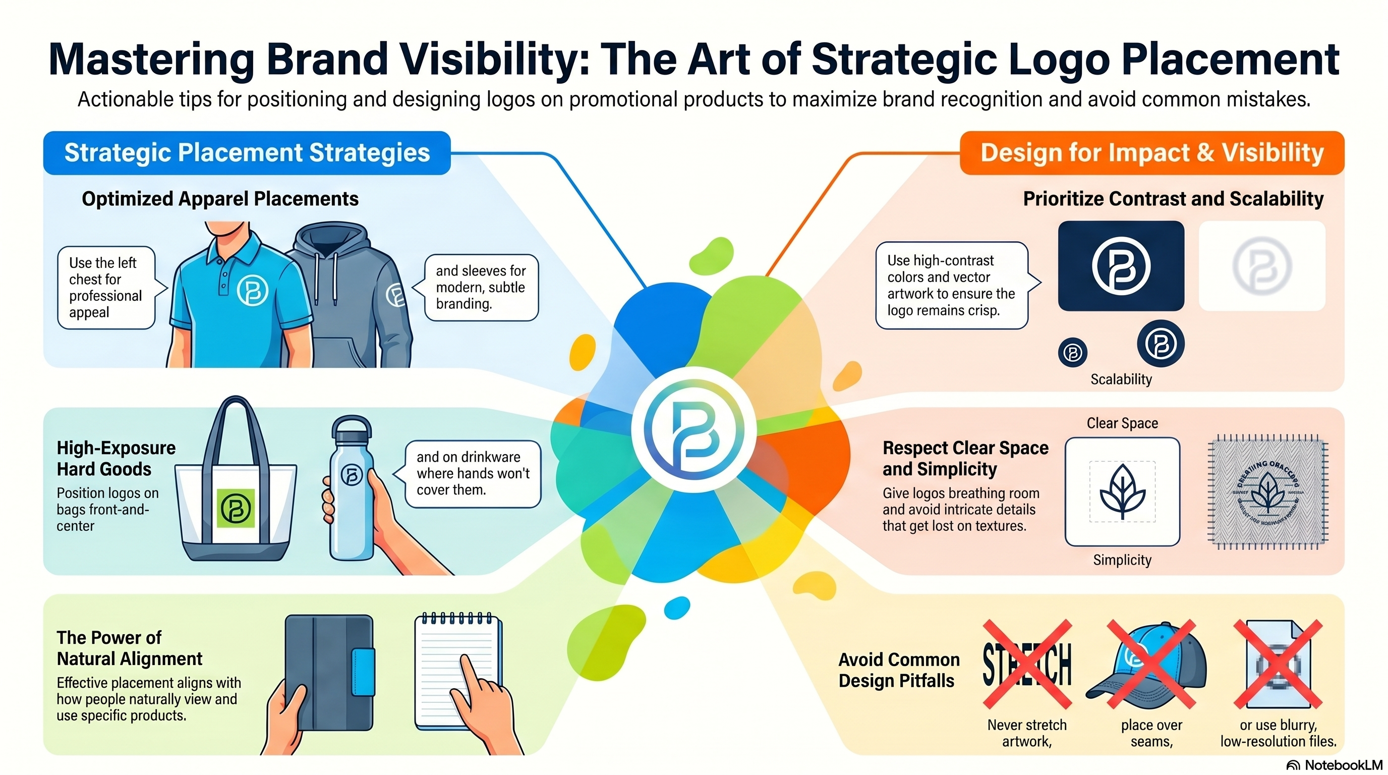
Key Takeaways:
- Strategic logo placement matters as much as logo design, influencing how often and how clearly your brand is seen.
- Natural placement improves recognition, with locations like left chest apparel, front center bags, and unobstructed drinkware surfaces performing best.
- Visibility beats over design, as high contrast, simple logos, and adequate clear space help brands stand out on real world products.
- Consistency builds brand memory, using the same logo treatments and placement styles across products strengthens recognition over time.
- Thoughtful restraint creates a more premium impression, while common mistakes—distortion, clutter, and low resolution artwork—can undermine brand impact.
Start With Placement That Feels Natural
The most effective logo placements align with how people naturally view and use products.
-
For polos and tees, the left chest remains the most recognized placement. It feels professional, balanced, and easy to spot in conversation.
Embroidery adds dimension and durability, while screen printing offers bold color at a budget-friendly price point.
For a more modern look, consider alternative placements like the sleeve, rear neckline, or hemline.
These subtle touches can feel elevated and unexpected while still reinforcing brand presence.
-
Front-and-center placement delivers maximum exposure in public settings. Side panels or gussets create repeat visibility as the bag moves.
-
Position logos where hands won’t constantly cover them. A wraparound imprint or centered front placement ensures the brand stays visible in meetings, at desks, and on the go.

Design for Visibility, Not Just Aesthetics
Even perfect placement can fall flat if the design isn’t optimized for the item.
-
Use High Contrast
Your logo should stand out clearly against the product color. Dark on dark or light on light may look subtle on screen but often disappears in real life.
-
Keep It Scalable
Use high-quality artwork that remains sharp at any size. Vector-based logos stay crisp, whether embroidered small or printed large. Low-resolution files can blur or pixelate.
-
Prioritize Simplicity
Clean, streamlined logos translate better across materials. Intricate details may get lost on embroidery or textured surfaces.
-
Create Flexible Versions
Have alternate logo variations ready — horizontal, stacked, one-color, or black-and-white. This flexibility allows your brand to adapt to different imprint areas without compromising integrity.
-
Respect Clear Space
Give your logo breathing room. Crowding it with text or graphics reduces impact and makes the design feel cluttered.
Consistency Supports Recognition
Repetition builds memory. Using the same logo version and consistent placement across apparel, accessories, and promotional products reinforces familiarity.
That doesn’t mean every item must look identical. Rather, your brand should feel cohesive. When someone sees your logo on a cap, then again on a tote or notebook, the visual connection strengthens over time.
Turn Everyday Items Into Brand Assets
When logo placement and design are handled with strategy, promotional products become more than giveaways.
They become mobile brand touchpoints that work long after the initial handoff.
At Amsterdam, we help guide logo sizing, positioning, and imprint methods so your products look intentional, polished, and built for visibility.
Mistakes That Undermine Brand Impact
- Placing logos over busy backgrounds or seams
- Stretching or distorting artwork to “make it fit”
- Using low-resolution files that appear blurry
- Overloading a product with multiple logos or excessive decoration
Remember: Thoughtful restraint often creates a more elevated result.
FAQs: Smart Logo Design and Placement
-
Why is logo placement important on promotional products?
Logo placement affects how easily your brand is seen and recognized. Strategic placement ensures your logo feels natural, visible, and memorable during everyday use.
-
What is the best logo placement for custom apparel?
The left chest is the most recognized placement for polos and t shirts, while sleeves, back necklines, and hems offer modern alternatives that still reinforce brand identity.
-
How can logo design improve visibility on promotional products?
High contrast, simple artwork, and proper clear space help logos stand out. Clean, scalable designs remain legible across different materials and imprint methods.
-
What mistakes reduce the impact of a logo on promotional items?
Common mistakes include placing logos over seams or busy backgrounds, using low resolution files, distorting artwork, or overcrowding products with multiple logos.
-
How does consistent logo use strengthen brand recognition?
Using consistent logo versions and placement styles across products creates familiarity. Repetition helps consumers recognize and remember your brand more easily over time.
Published: 4/22/2026